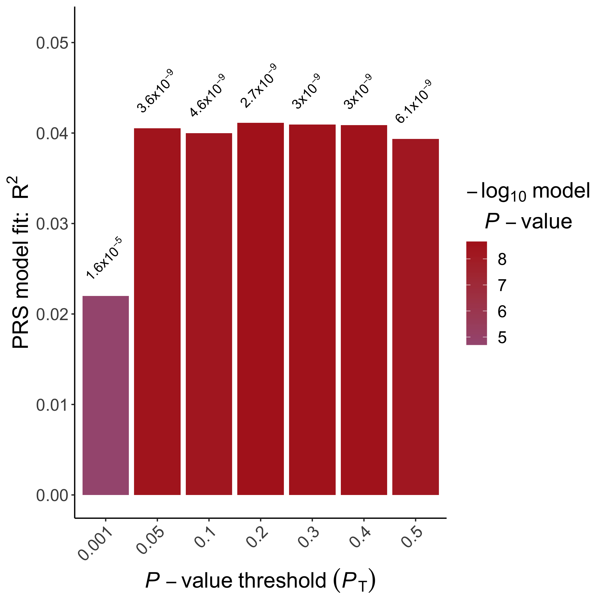
画图
可以使用R将与通过应用C + T PRS方法(例如,使用PLINK或PRSice-2)获得的P值阈值范围相对应的PRS结果可视化:
library(ggplot2)
# generate a pretty format for p-value output
prs.result$print.p <- round(prs.result$P, digits = 3)
prs.result$print.p[!is.na(prs.result$print.p) &
prs.result$print.p == 0] <-
format(prs.result$P[!is.na(prs.result$print.p) &
prs.result$print.p == 0], digits = 2)
prs.result$print.p <- sub("e", "*x*10^", prs.result$print.p)
# Initialize ggplot, requiring the threshold as the x-axis (use factor so that it is uniformly distributed)
ggplot(data = prs.result, aes(x = factor(Threshold), y = R2)) +
# Specify that we want to print p-value on top of the bars
geom_text(
aes(label = paste(print.p)),
vjust = -1.5,
hjust = 0,
angle = 45,
cex = 4,
parse = T
) +
# Specify the range of the plot, *1.25 to provide enough space for the p-values
scale_y_continuous(limits = c(0, max(prs.result$R2) * 1.25)) +
# Specify the axis labels
xlab(expression(italic(P) - value ~ threshold ~ (italic(P)[T]))) +
ylab(expression(paste("PRS model fit: ", R ^ 2))) +
# Draw a bar plot
geom_bar(aes(fill = -log10(P)), stat = "identity") +
# Specify the colors
scale_fill_gradient2(
low = "dodgerblue",
high = "firebrick",
mid = "dodgerblue",
midpoint = 1e-4,
name = bquote(atop(-log[10] ~ model, italic(P) - value),)
) +
# Some beautification of the plot
theme_classic() + theme(
axis.title = element_text(face = "bold", size = 18),
axis.text = element_text(size = 14),
legend.title = element_text(face = "bold", size =
18),
legend.text = element_text(size = 14),
axis.text.x = element_text(angle = 45, hjust =
1)
)
# save the plot
ggsave("EUR.height.bar.png", height = 7, width = 7)
Example Bar Plot
An example bar plot generated using ggplot2
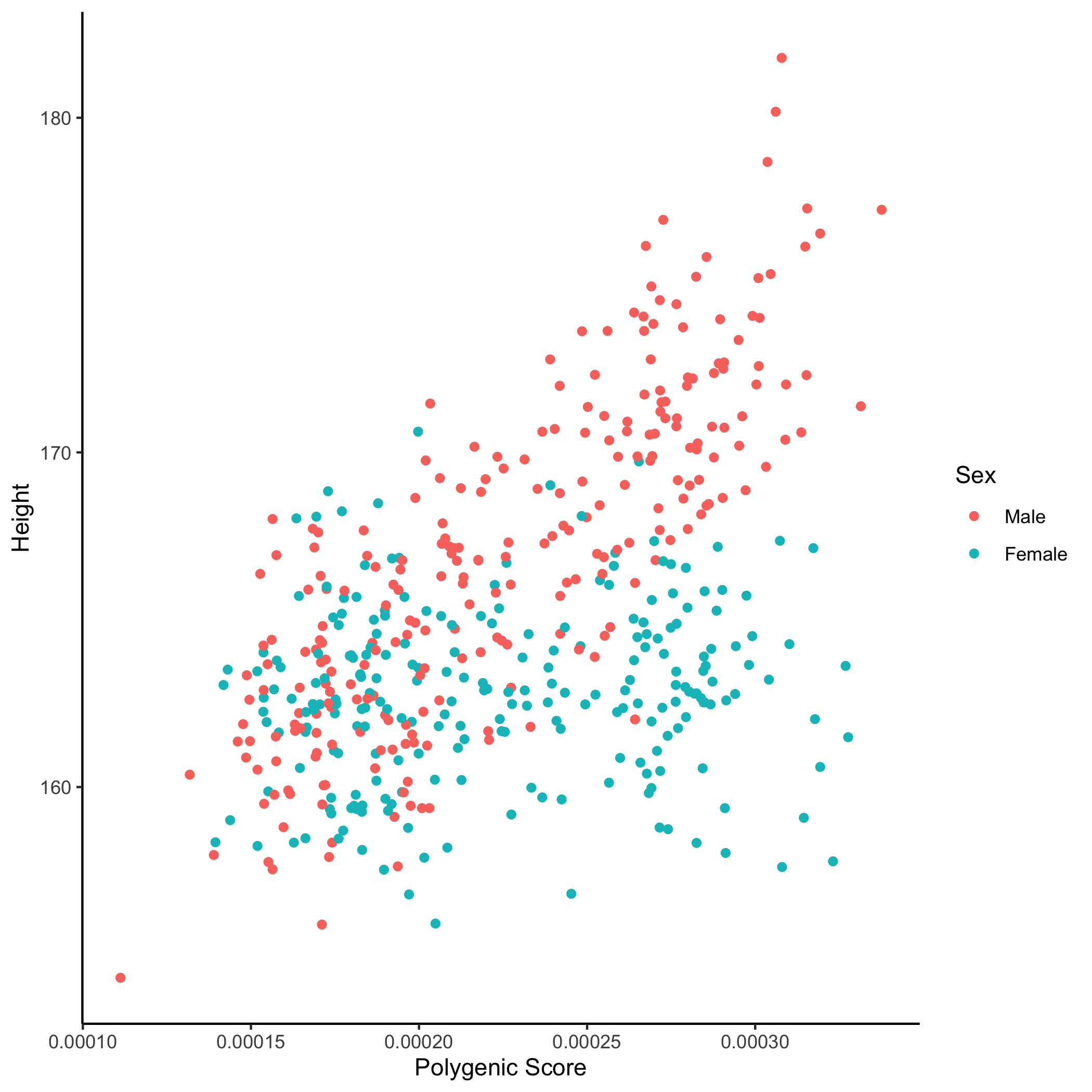
In addition, we can visualise the relationship between the "best-fit" PRS (which may have been obtained from any of the PRS programs) and the phenotype of interest, coloured according to sex:
Without ggplot2
# Read in the files
prs <- read.table("EUR.0.2.profile", header=T)
height <- read.table("EUR.height", header=T)
sex <- read.table("EUR.covariate", header=T)
# Rename the sex
sex$Sex <- as.factor(sex$Sex)
levels(sex$Sex) <- c("Male", "Female")
# Merge the files
dat <- merge(merge(prs, height), sex)
# Start plotting
plot(x=dat$SCORE, y=dat$Height, col="white",
xlab="Polygenic Score", ylab="Height")
with(subset(dat, Sex=="Male"), points(x=SCORE, y=Height, col="red"))
with(subset(dat, Sex=="Female"), points(x=SCORE, y=Height, col="blue"))
然后就得到了这个图:
此外,我们可以可视化“最适合的” PRS(可能已从任何PRS程序获得)与感兴趣的表型之间的关系,并根据性别进行了着色:
library(ggplot2)
# Read in the files
prs <- read.table("EUR.0.2.profile", header=T)
height <- read.table("EUR.height", header=T)
sex <- read.table("EUR.covariate", header=T)
# Rename the sex
sex$Sex <- as.factor(sex$Sex)
levels(sex$Sex) <- c("Male", "Female")
# Merge the files
dat <- merge(merge(prs, height), sex)
# Start plotting
ggplot(dat, aes(x=SCORE, y=Height, color=Sex))+
    geom_point()+
    theme_classic()+
    labs(x="Polygenic Score", y="Height")
然后就得到了下图: